In this blog post (aka tutorial) you will learn how to make a responsive image slider from scratch. It will be implemented using HTML, CSS and JavaScript + jQuery. The finished example will provide a base from which you can extend and customize as you wish.
Each slide will comprise an image and arbitrary HTML content, which could include text, links, lists or indeed any valid HTML markup.
-
 Slide One
 -

-
Why make my own slider?
There are many slider generator tools out there, including Image Slider Maker and often it is appropriate to them. But if you want something bespoke then creating your own from scratch may be simpler than incorporating and adapting a third party implementation. By creating your own from the ground up you will have full control over the way it works and looks.
1. Create a simple HTML page
To get started use a text editor to create a new HTML file and name it slider.html. Populate the file with the following:
<html>
<head>
<title>Slider</title>
</head>
<body>

<h1>Slider</h1>

<div class="container">
</div>

</body>
</html>
The container div will be the parent element for your slider.
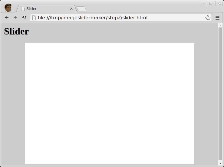
2. Add style to create a basic single column page layout
Add a style element to the head of your HTML like this:
<html>
<head>
<title>Slider</title>
<style>
body {
  background-color: #ccc;
}

.container {
  margin: 0 auto;
  width: 80%;
  background-color: #fff;
  min-height: 400px;
}
</style>
</head>
<body>

<h1>Slider</h1>

<div class="container">
</div>

</body>
</html>
This results in a centered white column on a grey background. There's nothing special about it except for the sake of example it produces the layout of the page your slider will sit in. Shortly you will create a separate CSS file where you will define the slider's style.
Save slider.html and refresh your browser:
3. Images
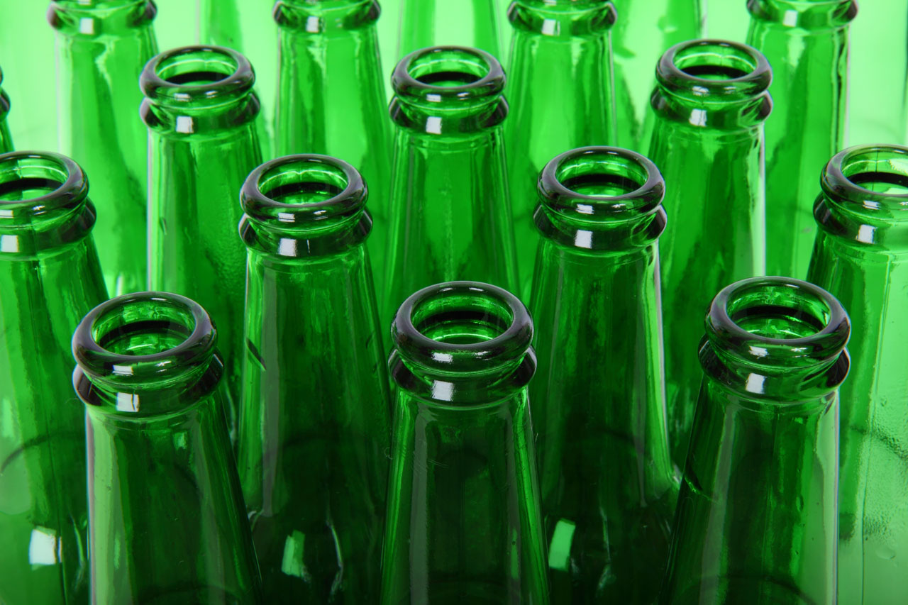
For simplicity the slider will have 3 slides. The following images are each 1280 pixels in width:
In general images intended to responsively fit the width of a web page should be about 1000 pixels across, although this is a rule of thumb and will depend on the level of detail in the image. Generally, the more detail there is in a photo or image, the larger the file size. Highly detailed images, if resized down too small will become fuzzy on large displays, but if too large may take too long to load. In most cases your aim should be to first select appropriate images, free from excessive detail, then to resize them down as much as possible, but so they still appear reasonable when upscaled on 1920 pixel displays.
Save the images (by right-clicking on them) to the same directory as slider.html.
4. HTML to define the slider and its slides
Now for the slider markup, which is inserted inside the container div. The slider has a div element with its class name set as "slider". Within the slider's div is an unordered list that contains img elements—one for each image.
<html>
<head>
<title>Slider</title>
<style>
body {
  background-color: #ccc;
}

.container {
  margin: 0 auto;
  width: 80%;
  background-color: #fff;
  min-height: 400px;
}
</style>
</head>
<body>

<div class="container">

<h1>Slider</h1>

<div class="slider">
  <ul>
    <li>
      <img src="thermometer.jpg" />
    </li>
    <li>
      <img src="building.jpg" />
    </li>
    <li>
      <img src="green-bottles.jpg" />
    </li>
  </ul>
</div>

</div>

</body>
</html>
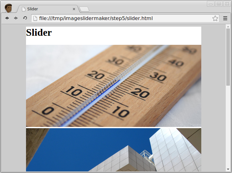
After saving and refreshing it should look like this:
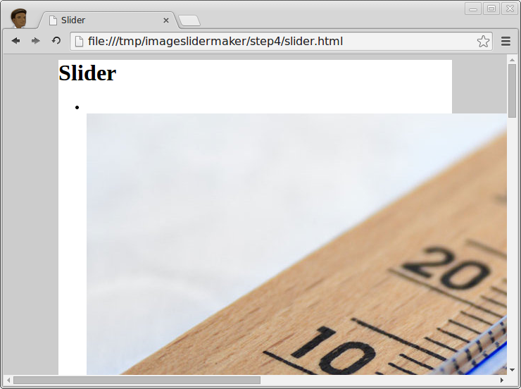
Depending on your browser window size you may find the images flow off the right side of the page. This is normal browser behavior which will be addressed next.
5. Create a stylesheet for the slider
Create a new CSS file named slider.css and populate it with the following:
.slider {
width: 100%;
}

.slider ul {
margin: 0;
padding: 0;
list-style: none;
}

.slider li img {
width: 100%;
border: none;
}
Include the stylesheet by adding a link tag after the title tag in your HTML's head:
<link rel="stylesheet" href="slider.css">
The CSS rules defined in slider.css set the slider's and images' widths to the width of the parent container. In addition, the ul list has its bullets removed via the list-style property and its margin and padding set to zero.
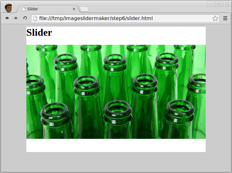
The images now sit neatly on the page and do not overflow.
6. Extend the CSS so the slides are ready to be manipulated by JavaScript
The goal is a slider where the images slide left and right with an animated transition. To achieve this the slider's li elements must be positioned side by side. The total width of the combined slides will exceed the width of the page, but with some CSS all but the active slide will be hidden from view.
Modify slider.css to the following:
.slider {
width: 100%;
overflow: hidden;
height: 300px;
position: relative;
}

.slider ul {
margin: 0;
padding: 0;
list-style: none;
position: absolute;
width: 300%;
height: 100%;
top: 0;
}

.slider li {
padding: 0;
margin: 0;
width: 33.333333%;
height: 100%;
overflow: hidden;
position: absolute;
top: 0;
bottom: 0;
}

.slider li img {
border: none;
width: 100%;
min-height: 100%;
}
The .slider element now has its overflow style property set as hidden, which ensures none of its child elements are visible beyond its edges. The height is set, in this case to 300 pixels. The height you choose will depend on the size of the images and the layout of your page.
Using the .slider ul selector the unordered list has its position set to absolute, so the ul can be absolutely positioned relative to in parent, .slider. A jQuery function will manipulate the ul's horizontal position to achieve the sliding effect.
The ul's width is set to accommodate all 3 slides side by side. Because there are 3 slides its width is set as 300%. Each li element has its width set to a third or 33.333333%, which is 100% divided by the number of slides.
The img's have their min-height property set to 100% so that the images always fill the vertical space within the slider element. Without this when the browser window is very small the images' heights could contract leaving a gap at the bottom of the slider. To test this resize the width of your browser window and you will notice the aspect ratio of the image changes.
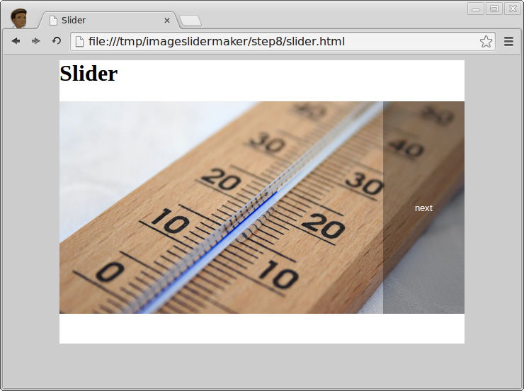
Only slide 3 is visible now, because the slides are rendered on top of one another. JavaScript will set the left position of each of the slides.
7. Navigation controls
There are various conventions when it comes to slider controls. Back and forward buttons, also known as 'previous' and 'next' are common. Using CSS they can be positioned over the slides and set to disappear when not in use.
Radio buttons, also known as markers are also commonly used, which are typically displayed as a horizontal strip in the lower part of the slider. They not only provide controls for moving between slides but also make clear where the active slide is in relation to the other slides.
Thumbnails offer richer navigation, enabling visual previews so the user gets an idea of what's to come. Keyboard, drag, swipe and touch are also all valid methods to move between slides.
Alternative control methods will be covered in future blog posts. In this tutorial simple back and forward buttons will be used.
Add the two button elements after the closing ul tag so that slider.html becomes:
<html>
<head>
<title>Slider</title>
<link rel="stylesheet" href="slider.css">
<style>
body {
  background-color: #ccc;
}

.container {
  margin: 0 auto;
  width: 80%;
  background-color: #fff;
  min-height: 400px;
}
</style>
</head>
<body>

<div class="container">

<h1>Slider</h1>

<div class="slider">
  <ul>
    <li>
      <img src="thermometer.jpg" />
    </li>
    <li>
      <img src="building.jpg" />
    </li>
    <li>
      <img src="green-bottles.jpg" />
    </li>
  </ul>
  <button class="prev">prev</button>
  <button class="next">next</button>
</div>

</div>

</body>
</html>
Add these four style rules for the buttons to slider.css:
.slider button {
position: absolute;
display: block;
box-sizing: border-box;
border: none;
outline: none;
top: 0;
bottom: 0;
width: 20%;
background-color: rgba(0, 0, 0, 0.3);
color: #fff;
margin: 0;
padding: 0;
text-align:center;
opacity: 0;
z-index: 2;
}

.slider button.prev {
left: 0;
}

.slider button.next {
right: 0;
}

.slider button:hover, .slider button:active {
opacity: 1.0;
}
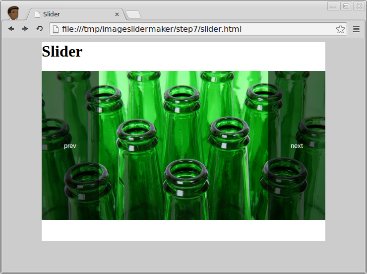
Now if you refresh the page and hover over the left or right side of the slider, the buttons will appear. The buttons are not yet functional. In the next section you will add event listeners to each button.
8. JavaScript to animate slide transitions when buttons are clicked
Now create the slider's JavaScript file. Name it slider.js and save to the same directory as the other files:
$(function() {

var ul = $(".slider ul");
var slide_count = ul.children().length;
var slide_width_pc = 100.0 / slide_count;
var slide_index = 0;

ul.find("li").each(function(indx) {
var left_percent = (slide_width_pc * indx) + "%";
$(this).css({"left":left_percent});
$(this).css({width:(100 / slide_count) + "%"});
});

// Listen for click of prev button
$(".slider .prev").click(function() {
console.log("prev button clicked");
slide(slide_index - 1);
});

// Listen for click of next button
$(".slider .next").click(function() {
console.log("next button clicked");
slide(slide_index + 1);
});

function slide(new_slide_index) {

if(new_slide_index < 0 || new_slide_index >= slide_count) return;

var margin_left_pc = (new_slide_index * (-100)) + "%";

ul.animate({"margin-left": margin_left_pc}, 400, function() {

slide_index = new_slide_index

});

}

});
In slider.html add these two script tags before the closing head tag:
<script src="http://code.jquery.com/jquery-2.1.1.min.js"></script>
<script src="slider.js"></script>
The first loads jQuery (from its CDN) and the second includes your slider script.
Reload the page and click the buttons to test. A message is appended to the console each time a button is clicked. In Chrome use Ctrl+Shft+J to open the console, or in Fireox use Ctrl+Shft+K.
An explanation of the JavaScript
At the top a number of variables are declared and assigned: ul is a jQuery instance of the slider's ul element, slide_count is an integer representing the number of slides, slide_width_pc is the percentage width of each slide and slide_index is a zero based index that keeps track of the active (visible) slide.
The li elements are iterated over and their CSS left positions set according to their indexes. For example, the third slide's index is 2, so its left property is set to ((100 / 3) * 2)%. That's 2/3 of the way along the ul element, which you would expect for a 3-slide slider. Because the li widths are now programmatically set, the width in slider.css is no longer strictly necessary, but could be left in place for the sake of graceful degradation.
jQuery is used to attach click event listeners to the buttons, where a callback function in each invokes the slide function. The slide function accepts the new slide index as an argument. If the given index is less than 0 or beyond the last slide's index the function returns without doing anything.
If the index is within range then a new value for the ul element's left margin is calculated and applied. The slide effect is achieved using jQuery's animate method, which when invoked iteratively changes the margin-left CSS property to the new value with a duration of 400 milliseconds.
On completion of the slide animation a callback function is invoked which sets slide_index's value to that of the new active slide.
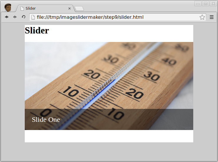
9. Add content to the slides
Now add content to slides 1 and 2. Update your slider.html like this:
<div class="slider">
<ul>
<li>
<img src="thermometer.jpg" />
<div class="content">Slide One</div>
</li>
<li>
<img src="building.jpg" />
<div class="content"><a href="http://imageslidermaker.com">Slide Two</a></div>
</li>
<li>
<img src="green-bottles.jpg" />
</li>
</ul>
<button class="prev">prev</button>
<button class="next">next</button>
</div>
Add the style rules for .content to slider.css:
.slider .content {
z-index: 3;
position: absolute;
bottom: 0;
left: 0;
right: 0;
height: 3em;
box-sizing: border-box;
background-color: rgba(0, 0, 0, 0.5);
color: #fff;
line-height: 3em;
padding: 0 1em;
font-size: 1.5em;
}

.slider .content a {
color: inherit;
}
The result is an absolutely positioned div with semi-transparent background and white text. An anchor tag is added to the second slide. The third slide is left without content. You can of course customize the content and style rules to meet your particular objectives.
The content div with z-index 3 has precedence over the buttons, which have a z-index of 2. This is desirable here to allow clicking of the link on slide 2. Under different circumstances you could consider setting the buttons with the highest z-index.
What next?
You have a simple content slider that currently has 3 slides. To add more simply insert additional li (and img) elements, and optionally add div's with class="content" if you require content on your slides.
If the look isn't exactly what you want, then amend the stylesheet. Also, extend the JavaScript if you require different functionality. A basic modification would be to change the animation speed from 400 ms to a different value.
An obvious modification is to hide the back and next buttons when on the first or last slides respectively. Alternatively you could make your image slider loop, using jQuery to create the slide effect between last and first slides.
Resources
Download the source files and images (right-click and save):
Share