This article is primarily intended for Image Slider Maker users, but may be more widely relevant for anyone who is creating an image (or content) slider for their website.
If your slider is for your business, then chances are you're either displaying products or an overview of the services you provide. It is obviously your goal that your website portrays your organization as competent and capable of providing a high quality service.
The truth is some sliders look plain ugly and are ineffective, whereas others look thoroughly stunning and convey the intended message.
Your choice of photos and how well you prepare them will be the biggest factor in determining how effective your image slider is.
There are a number of factors you should consider, including:
- photo quality
- image dimensions and file size
- slider responsiveness and aspect ratio
- image position and alignment on slide
Thankfully, there are a few simple steps you take to ensure your slider is aesthetically pleasing and engaging.
Photo Quality
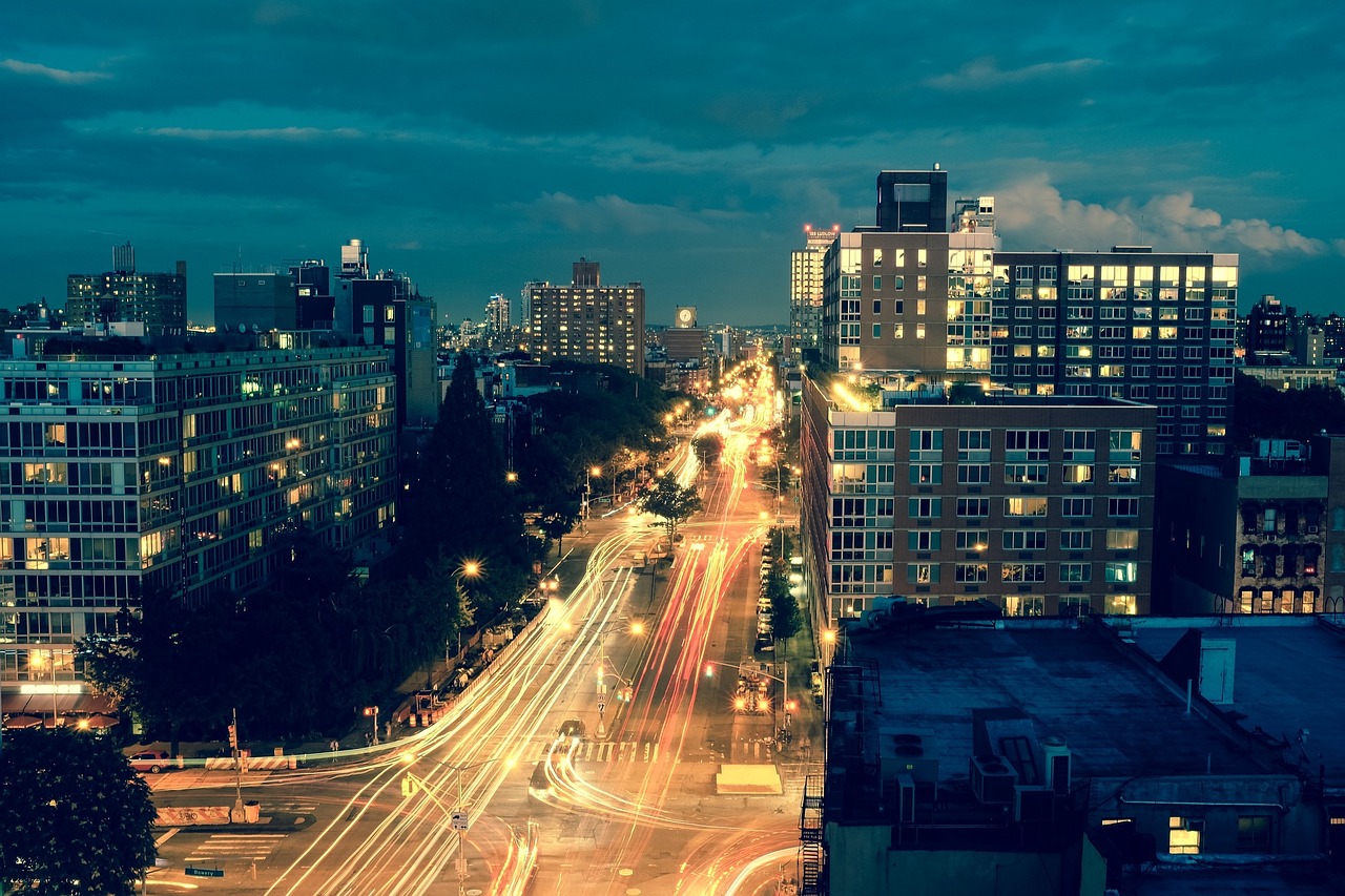
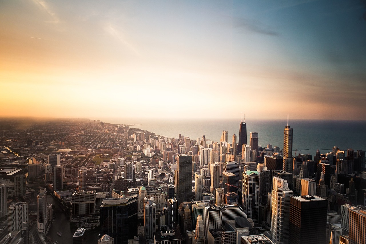
Your choice of photos is your starting point for a great looking slider. If you're taking photographs yourself, then make sure your subject is properly lit, use a tripod if possible, and ideally use a camera with a decent lense. There's a notable difference between photographs captured with a smartphone and photographs shot with an SLR camera, so if you do have access to high-end camera, then use it.
If your photos are from a stock photo provider, then simply take care to select appropriate images that are in keeping with your brand.
In either case, make sure the photos you use are high quality and of a reasonable resolution and size. It's no good using a 200 pixel image if you intend your slider to be 1600 pixels wide! If you use an image that is too small, it will be upscaled and will appear pixelated and grainy.
Because the images will be viewed in sequence (as part of a set) you should ensure they are stylistically similar. That is, they should be of the same quality and should not look out of place. If the first slide image is a professionally captured, paid-for stock photo, but the second is a poorly lit amateur photo, then there will be an obvious contrast that will be off-putting to your audience. Maintain a consist style and level of quality across all your slides.
Image Dimensions and File Size
After you have chosen your images, it is likely you will to need to resize them. Typically, photos captured on a camera or smartphone are 2000-5000 pixels across. In most cases 2000 pixels across will be unnecessarily large for use on a website. Typically, a value in the 800-1200 pixel range will be reasonable.
If you are going to set the width of your slider to a fixed pixel width (for example 600 px) or if you are planning on placing your slider in a fixed width page, then you should scale your images down to this known width, whilst maintaining the aspect ratio. Maintaining the aspect ratio, means you scale the height of the image by the same proportion as you scale the width, so if your image is 2000 pixels wide and 800 pixels in height, and you wanted to scale it down to 1000 pixels wide, then you'd set the height to 400 pixels, because 1000 / 2000 = 0.5 and 800 * 0.4 = 400.
Your goal should be to reduce the file size of each image as much as possible without sacrificing quality. If you plan to configure your slider as responsive, then ensure your images look reasonable across the range of widths, from 250 pixels to 2000 pixels. Responsive, means the slider will resize itself the size of its container HTML element, which in many cases with by the HTML body which is often equal to the browser window's width. 1080p monitors are increasingly common, which means your website is likely to be viewed in browser windows of 1920 pixel width.
In most cases, particularly for photographic images JPEG is the best file type to use. When you export (or save out) an image in Photoshop or similar, you will be given the option to set the amount compression. You may find a value around 80% is acceptable, although it will depend on the amount of image detail. If compression artifacts, such as blotchy patches or blurred edges are very obvious at 80%, then try 90% instead.
The process of image resizing and compressing will be one of trial and error. Be aware that different software application render and scale image using different algorithms, so to be sure your images will look good to your audience (or prospective customers), you really need to test them in your web browser. If implementing a responsive design, then you should assert your images look good when down-scaled and up-scaled.
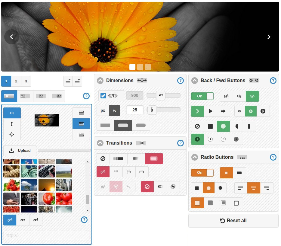
Slider Responsiveness and Aspect Ratio
You have a choice between responsive and a fixed pixel value for the width of your slider.
Responsiveness is set on if the «R» checkbox is checked (with the tick showing).
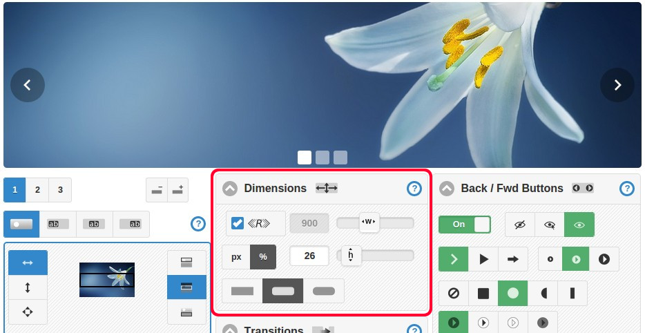
When responsive is set on, no width value is required, since the slider will automatically adjust itself to the width of its container (parent HTML element).
When responsive is off the numerical width value in pixels that you enter will be applied as the width of your slider.
There is a toggle button that allows you to set your slider's height as either a percentage of its width or as a fixed pixel value. When the percentage option is selected, the slider's aspect ratio is maintained. When the fixed pixel option is select, the slider's height will remain fixed regardless of the slider's width, so the aspect ratio will not be maintained. If the slider is responsive, then the aspect ratio could drastically vary depending on users' screen sizes.
Please note that these settings are applied to the slider, and not directly to the slide images. In many cases slide images will be larger than the slider and will be "cut off". This is normal and a reasonable technique, particularly where your slider is responsive, but required to maintain a fixed height.
Image Positioning and Alignment
You can position an image on each slide independently, so for example on slide 1 you might align the image to the top, but on slide 2 align the image to the bottom.
If the aspect ratio is not maintained (as discussed above), then take care when choosing these settings because under some conditions slide images could scale down to a size below the slider's area. If this happens, a grey background will appear on one or two sides of the image.
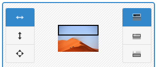
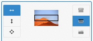
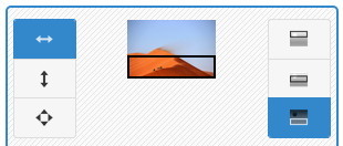
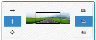
You have three image position modes, as follows:
1) Set the image's width equal to the slider's width, and maintain the aspect ratio of the image.
2) Set the image's height equal to the slider's height, and maintain the aspect ratio of the image.
3) Set the image's width equal to the slider's width and set the image's height to the slider's height, and so the aspect ratio will not be maintained.
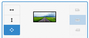
After deciding on the position mode for you can select the image alignment setting, either top, middle, bottom when fit-to-width is selected or left, center, right when fit-to-height is selected.
If at this point you are confused, then it might a good time to experiment with the generator tool and try it out for yourself. You will find the position mode is an obvious choice for most images: if an image is relatively tall compared to the slider, then fitting the image to width is normally the best option, whereas for short and wide images fitting the image to height is better.
Stretching an image to the slider's width should be reserved for abstract images, where the aspect ratio does not matter. Applying this mode on photos of products or real world scenes makes no sense, as you will want the aspect ratio to be maintained.
Conclusion
By being methodical and applying the techniques described, you will be able to produce highly effective sliders for your website.

In summary, select great photos, size them correctly, set the dimensions of your slider and select appropriate positioning settings for each slide image. Do these things right and you'll get great results.
Share