To get started, use the controls above to adjust your design, upload your own images and use the Download Zip button to get the generated code. Please consult the documentation below if you need guidance.
Use this button to download your slider code — everything you need is contained in the zip file.
 1
2
3
4
5
6
7
8
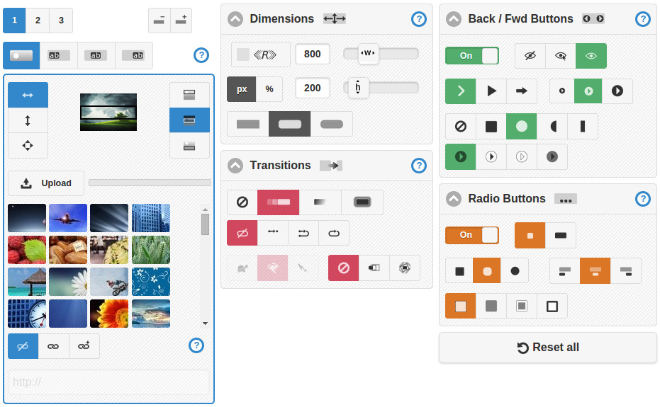
The design controls are organized across 5 panel segments. Any changes made via these controls will be reflected in the live preview above, in the source code output and will be used to construct the zip file, which you can download at any time.
If you experiment with the controls, their effect should be evident in most cases. Please refer the more detailed documentation below where it is not obvious, and please get in contact if you have any difficulties or a question.
 1
2
3
1
2
3
Use the slide number buttons to select the slide you wish to edit.
The slide add button allows you to incrementally increase the number of slides to a maximum of 10. Use the slide remove button to incrementally decrease the number of slides.
Use the image / caption tabs to switch between the image, caption 1, caption 2 and caption 3 settings for the active slide. For example, to adjust the image settings for a slide, first select the slide using the slide number buttons, then select the image tab. Likewise, to edit a caption, after selecting a slide, select one of the caption tabs. By default, for each slide, caption 1 is enabled, but captions 2 and 3 disabled.
 1
2
3
4
5
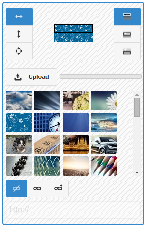
When you choose fit to width, the slide image scales to match the width of the slider. You could instead fit an image to the height of your slider or stretch it to fit in both dimensions.
Use the upload button to upload an image from your computer. You can either select an image from your local file system or drag and drop an image onto the upload button. The progress bar indicates the progress of an upload and will momentarily turn green upon completion. Uploaded images will appear in the image selection panel.
When you select an image in the image selector it is set as the image of the active slide.
These settings correspond to the active caption tab (and the active slide).
 1
2
3
4
5
6
7
8
9
10
11
12
1
2
3
4
5
6
7
8
9
10
11
12
 1
2
1
2
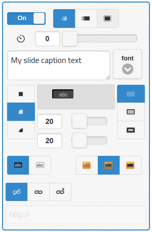
Toggle the flipswitch to enable or disable a caption. Enabled captions will appear at the set delay time (in milliseconds) after the transition to a slide has completed. You can choose the display effect.
Edit your caption text or HTML in the text area. There is no limit of length, but be aware captions may appear differently across different user platforms if responsive checked. If entering HTML, take care that it is valid to avoid unexpected behavior. Line breaks are respected - they are converted to <br> elements.
You can style and set the position of each caption. Choose between square or rounded corners, borderless or bordered, color and transparency. Position a caption using the two horizontal and vertical position controls.
You can set a caption to be a hyperlink, which will either open in the current tab or in a new tab. If you have selected link, use the text box below to enter a URL, path or hash tag.
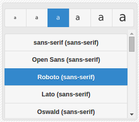
Use the font button to show or hide the font size and family selection panel.
To set the font family, scroll through the font selection list and select an item. Sans-serif fonts are listed first, followed by serif, display, handwriting and finally, monospace.
The slider's top level DIV element is uniquely identified by its id attribute. Each of the selectors in the generated CSS is prefixed by this ID.
If you would like multiple sliders on one page, then you must set the ID of each slider you create to a unique value. If you require only one slider on your page, then you do not need to set the ID and can safely leave it as its default value.
 1
2
3
4
5
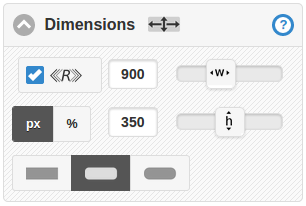
Responsive means the slider will fill its container's width. If there is no container, such as a parent div element, then the slider will be full page width. If you adjust the width value control the responsive checkbox will become unchecked and the provided value will be used.
Use the px / % buttons to choose your height units, either pixels (px) or percentage (%) of width. When px is selected the height value control sets the height to a fixed number of pixels. When % is selected the height value control sets the height as a percentage of width. The latter is dynamic, so if responsive is checked the height will automatically adjust it self to maintain the same aspect ratio. Be sure that the images you use are suitable for your width and height settings. If responsive, assert that your images are tall or wide enough to fill the slider across various screen sizes.
 1
2
3
4
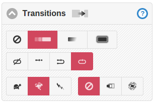
When set to instant a slide transition is immediate, without animation taking place. If set to slide, during a transition the current and new slides move together horizontally until the new one is fully in view. In fade mode the current slide fades out during which the new one fades in to replace it. Zoom is similar to fade, except the current slide is up scaled during its fade out resulting in a zooming effect.
With autoplay turned on (not set to manual), transitions between slides will happen automatically. If set to once the slides will be displayed in sequence until the last slide, which will remain in place. Once and rewind is similar except after all slides have been sequentially displayed, a transition will take place back to the start. In loop mode transitions will continue indefinitely.
Auto play will stop if a user manually changes the slide, either by swiping, using the forward/back buttons or radio buttons.
The speed setting determines the interval between transitions and can be set to slow, medium or fast, where slow has an interval of 10 seconds, medium 7 seconds and fast 4 seconds.
The image effect is different to the transition type: it is applied to the image between transitions. If set to zoom-pan the image is subtly zoomed and panned. Zoom-rotate is similar, except the image gradually rotates instead of panning.
 1
2
3
4
5
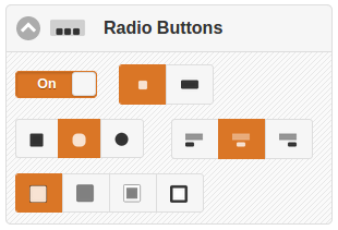
The radio buttons can be enabled in addition to the forward / back buttons or instead of. The indicate the current slide with respect to the sequence of all slides. A user can use the radio buttons to navigate between slides.
When set as thumbnails, the slide images are shown in place of the radio buttons.
Align them left, centered or right and set their color, optionally with a border.
 1
1
 2
3
2
3
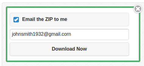
You can download your slider at any time. Use the Download Zip button, which will open the download options panel. In the options panel, check the Email the Zip to me checkbox and enter your email address if you would like your slider code and images sent to you. In all cases, use the Download Now button to start the download (or/and to receive the email).
It is advised to keep this page open in your browser while you download and test. Then if you need to make changes, you can do so without starting over.
 1
1
 2
3
4
2
3
4
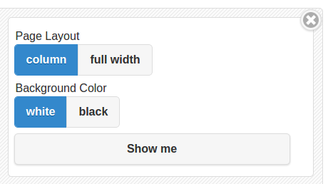
At any time you can use the Show in a page feature to see how your design will appear in a simple web page. After pressing the button, choose the page layout type and background color. If your slider is responsive full width may be a better option.
 1
2
3
1
2
3
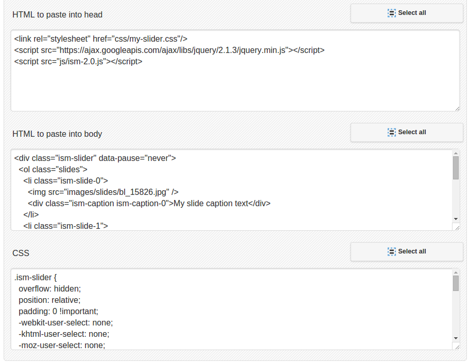
As an alternative to downloading the zip file, you can copy and paste the HTML markup from these textareas straight into your own web page source.
The code in outputted here is updated whenever you make a change to any settings. For example, if you add a slide and additional list element will be appended to the body HTML, or if you change the button color the CSS will be modified to reflect the change.
You can use the Select all buttons to select the entire text content on of the textareas.